BRAND ID SYSTEMS
Designing Trust, Not Just Tech
ClientDatamaranServicesBrand ID Systems / Brand Creator & Design LeadYear2014-presentLinkdatamaran.com
Datamaran®: A Brand Born out of Strategic Foresight
Summary
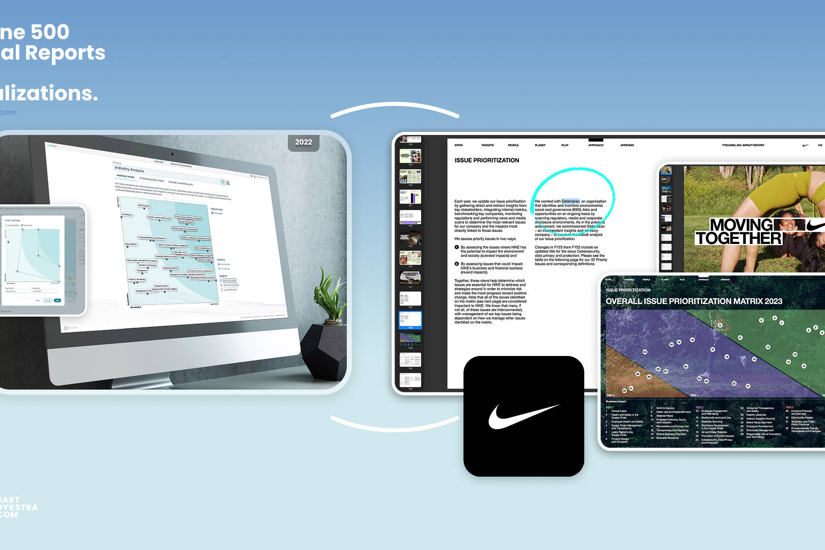
Datamaran’s brand identity, which I conceived in 2014 from brand name and logo invention to its presence on Nasdaq’s Times Square screens, is a living system built on thoughtful, strategic design. From the D‑shaped sail mark and signature turquoise palette to a rigorous brand book and evolving typography, the visual identity, including data visualisations that powered Fortune 500 strategies and annual reporting, has shaped global investor stages and enterprise‑scale storytelling while remaining instantly recognizable and true to its core idea: agile navigation through data oceans.
A brand built from the name up
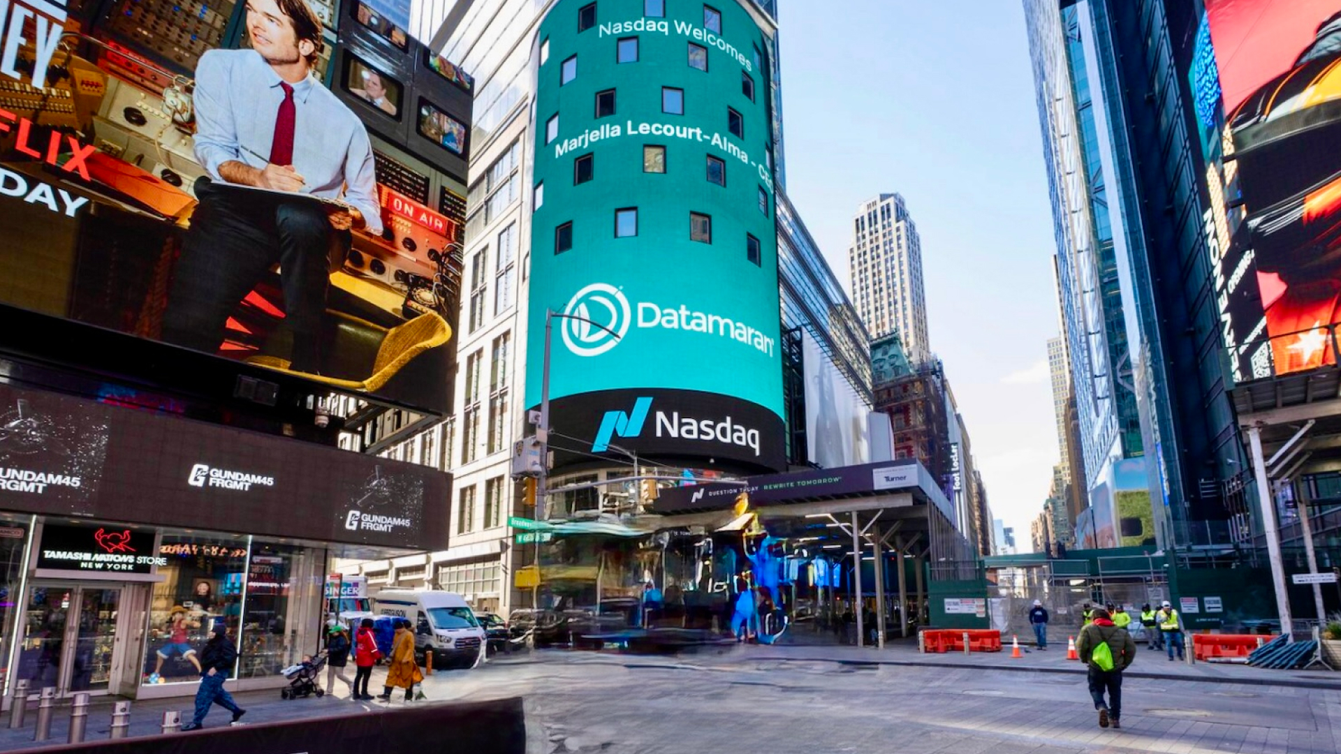
I joined Datamaran’s founding team in 2014 and built the brand from zero — inventing the name, designing the trademarked logo, and defining the identity system that still runs the company more than a decade later. That system now appears in Fortune 500 annual reports and on Nasdaq’s Times Square screens, and it sustained the brand through its growth from seed to a $33M Series C.
This is a case study in foundational design: the decisions made at the start, and why they still hold.
The name and the mark
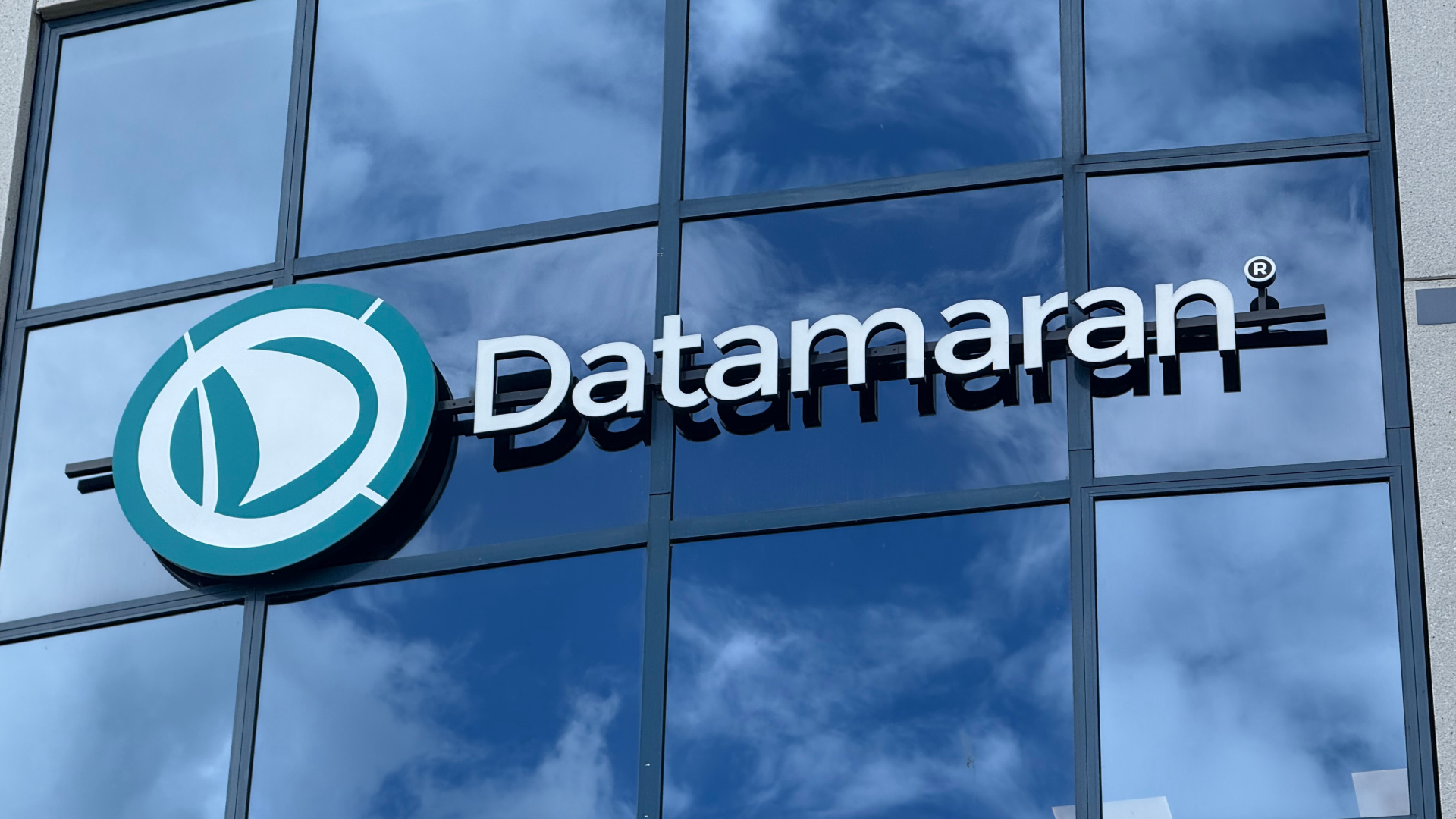
The mark: a sail rendered in negative space inside a broken infographic circle. The gap keeps it open and forward-leaning rather than enclosed — navigation, not a seal. Registered with the USPTO.
Datamaran blends data and catamaran — agile navigation through vast volumes of information. The logo turns that idea into form: a D-shaped sail held inside a broken infographic circle, in a turquoise built to read as trust, clarity, and momentum.
The concept gave the brand a single organizing metaphor — navigating data — that every later decision could be measured against. The mark is registered with the US Patent and Trademark Office, carrying the ® officially.
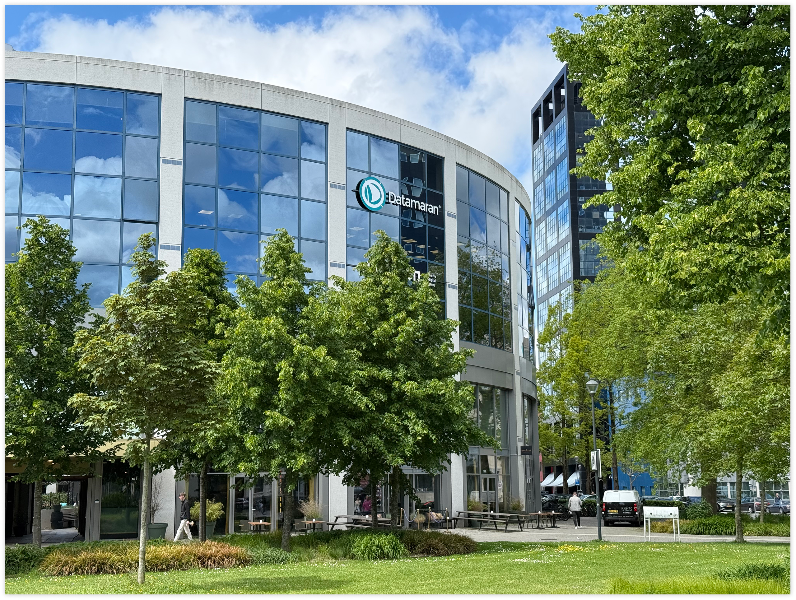
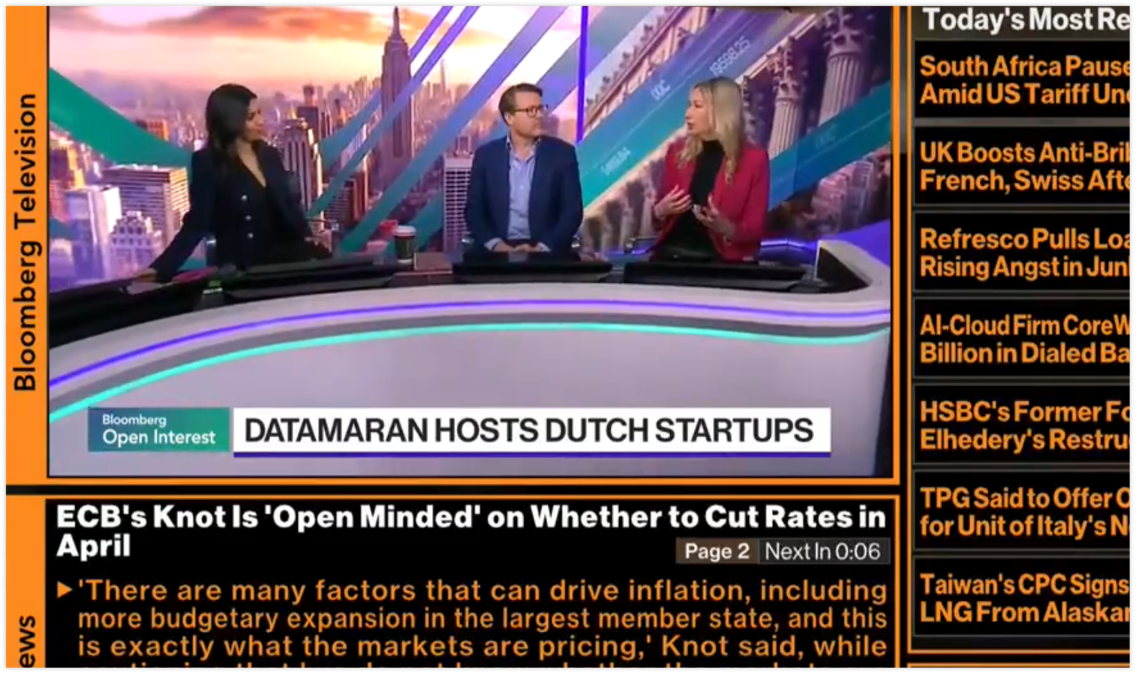
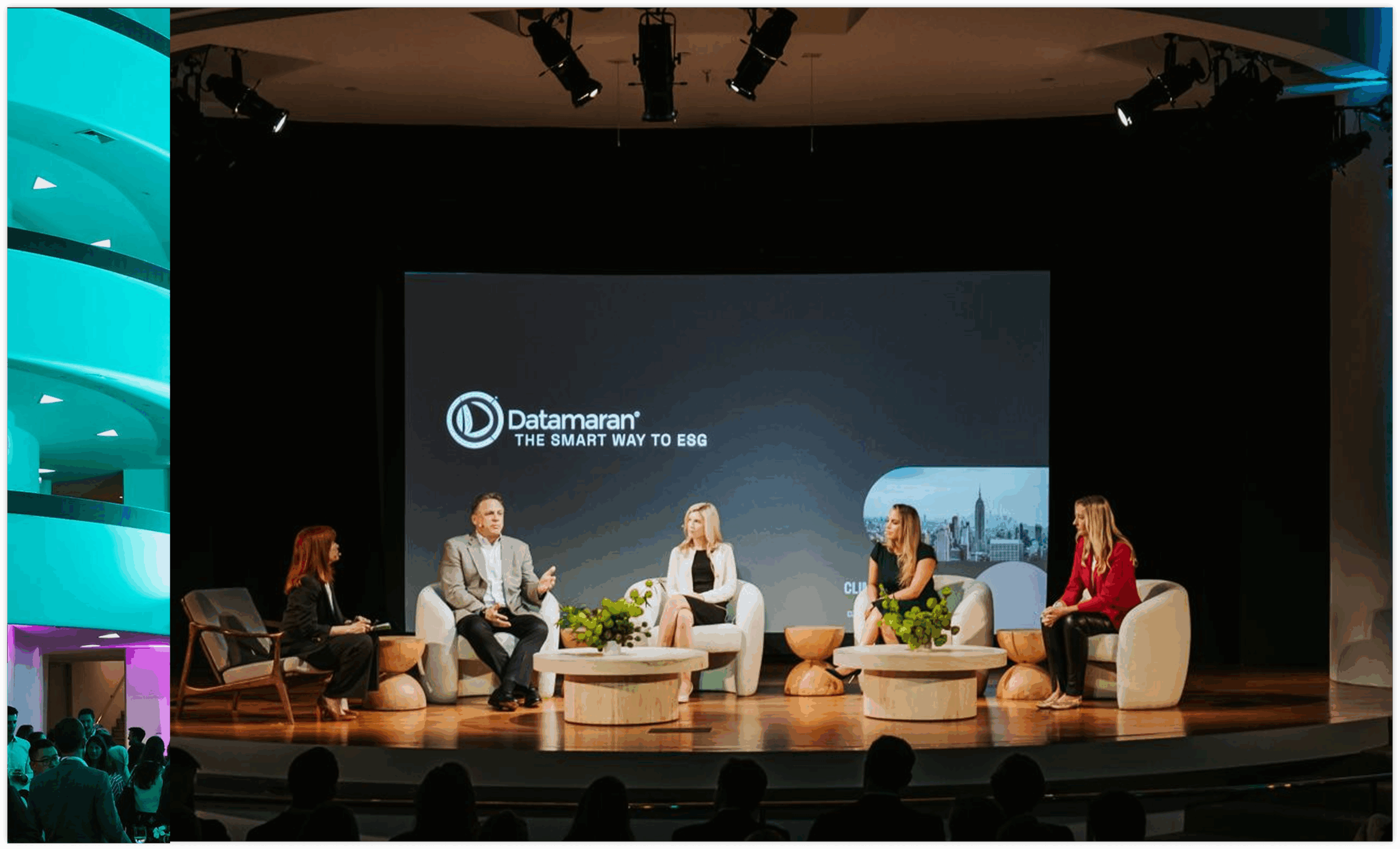
Built to scale across contexts
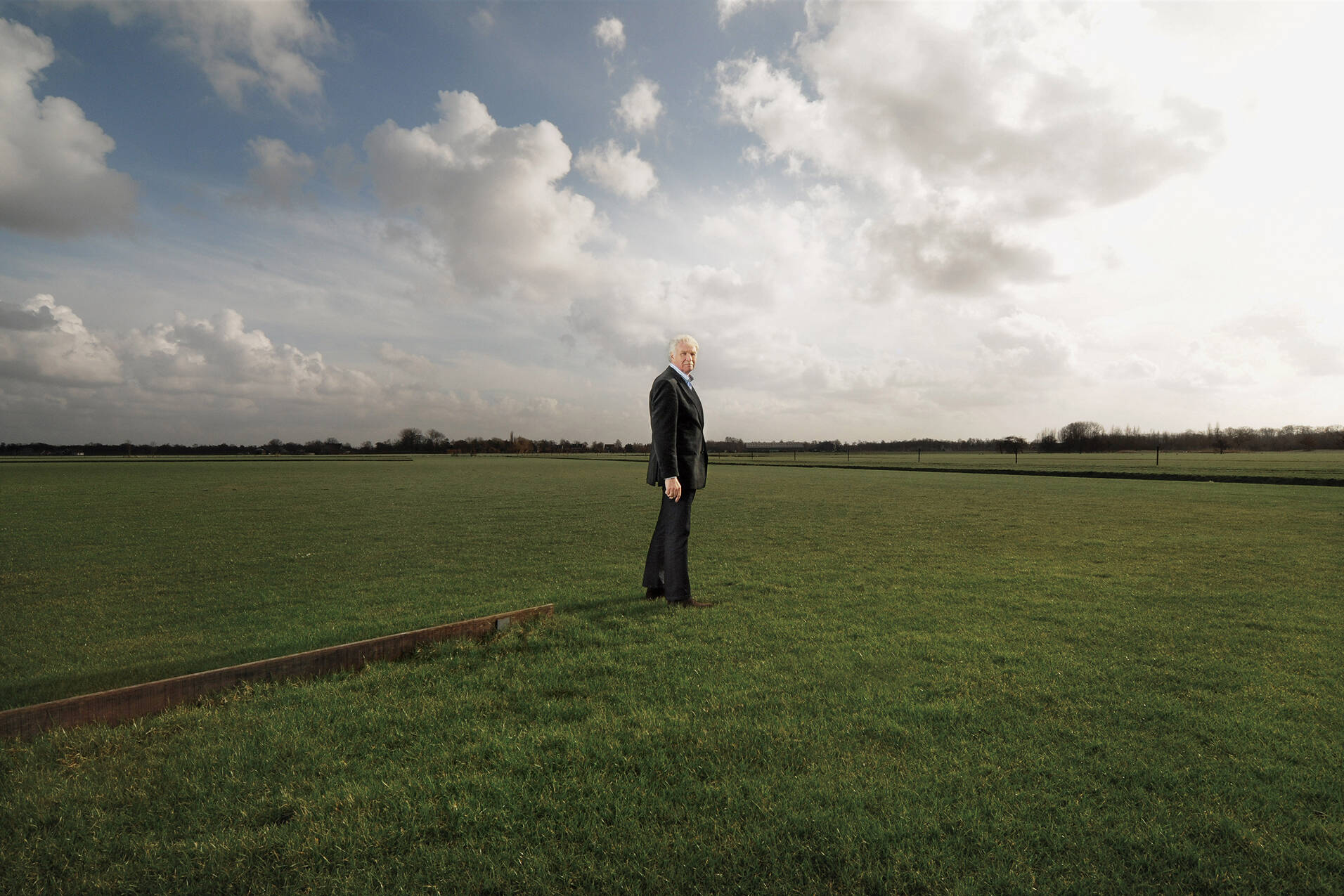
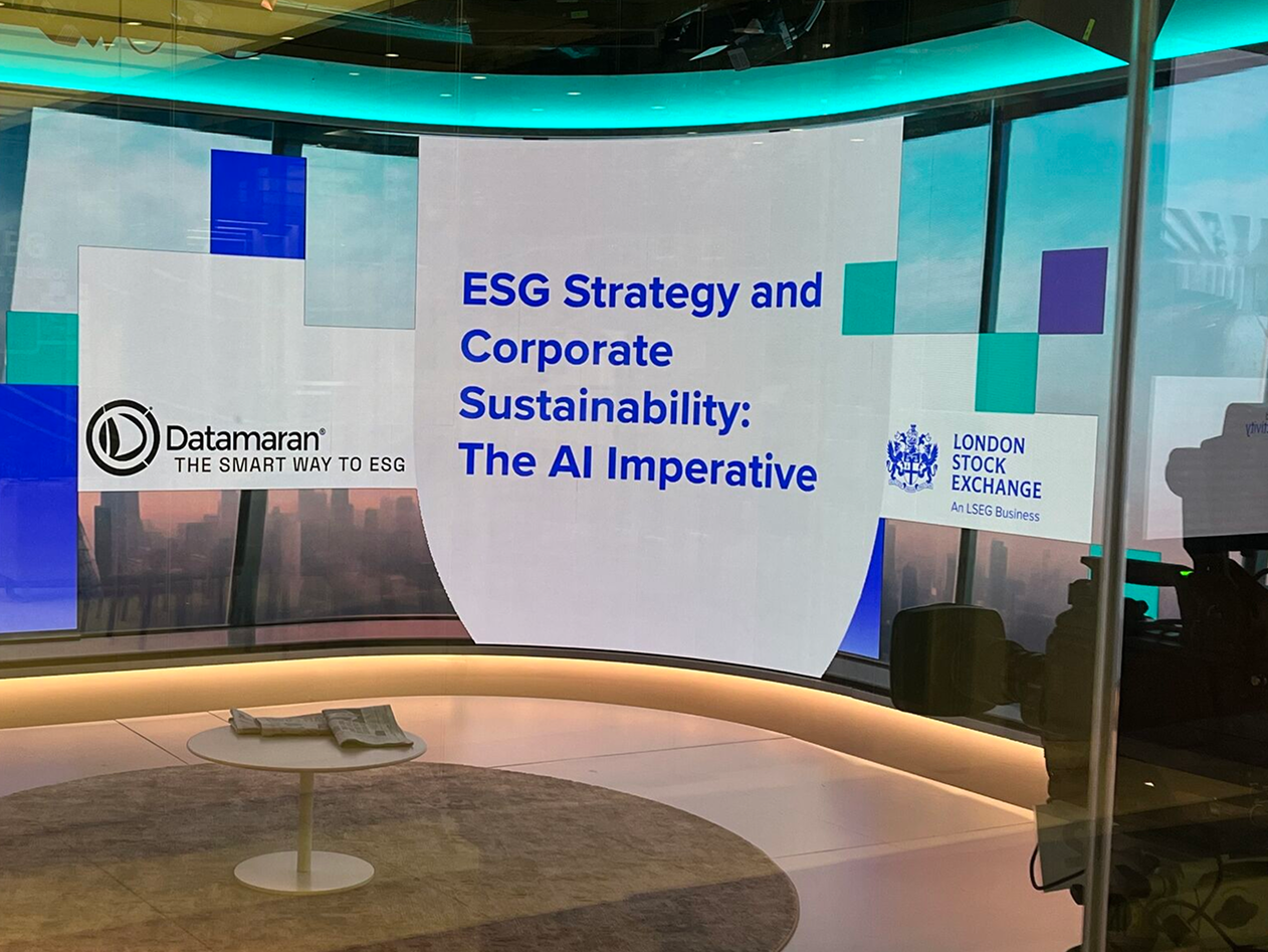
A founding-stage identity has to survive contexts you can’t predict at launch. Datamaran’s has: from the Netherlands HQ facade to Guggenheim conference stages, Bloomberg TV, the London Stock Exchange, and Nasdaq’s Times Square screens — while staying instantly recognizable at every size and surface.
That durability is the point. The system was designed once, well, and hasn’t needed reinvention to keep up.
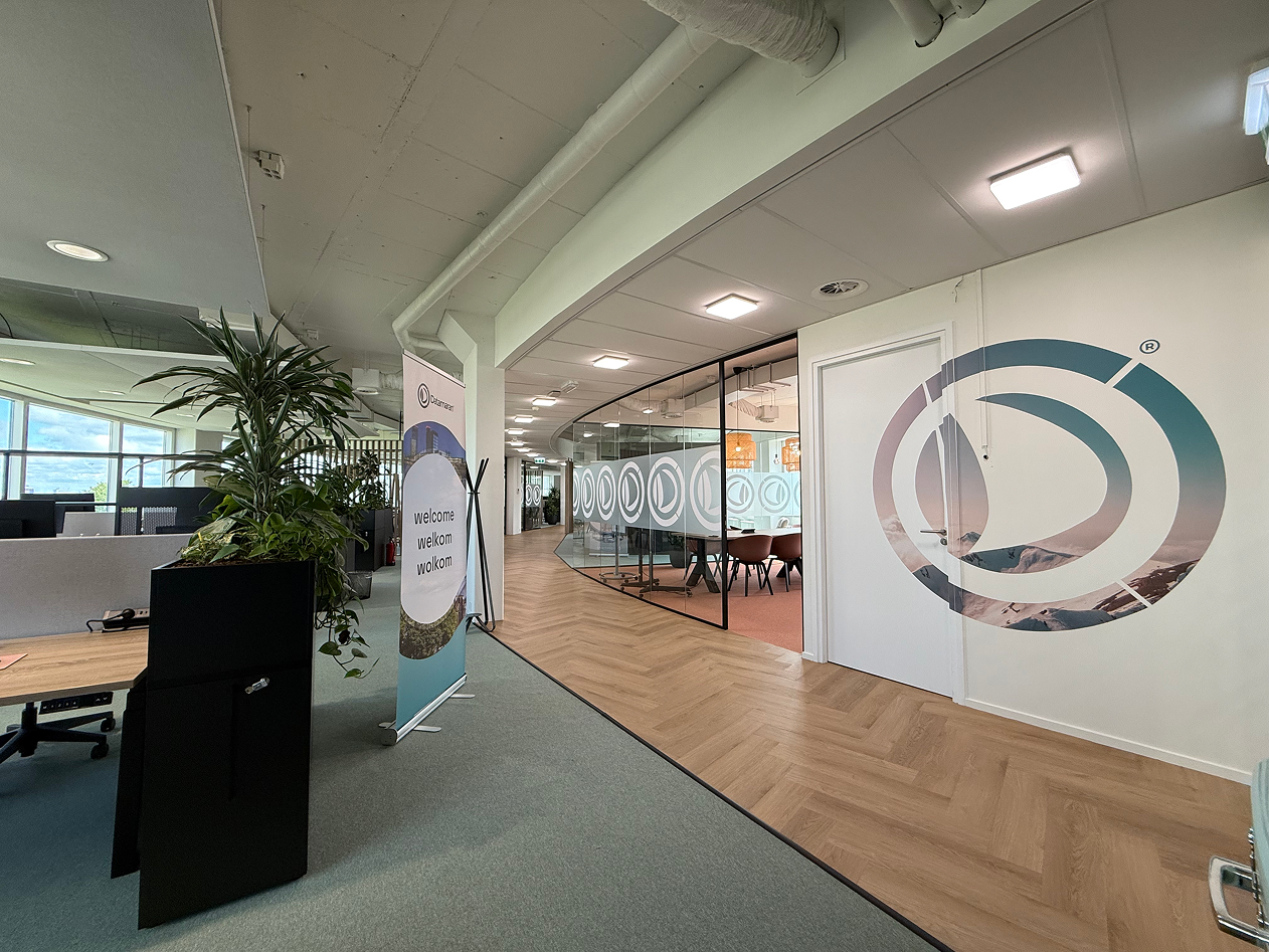
The brand book: one identity, many jobs
The brand book exists to keep the identity consistent everywhere it appears — and, more importantly, to let it do different jobs without losing itself. The clearest example is typography, which I evolved deliberately across four eras as the company’s needs changed:
- Montserrat + Avenir — early marketing: bold, confident, attention-first.
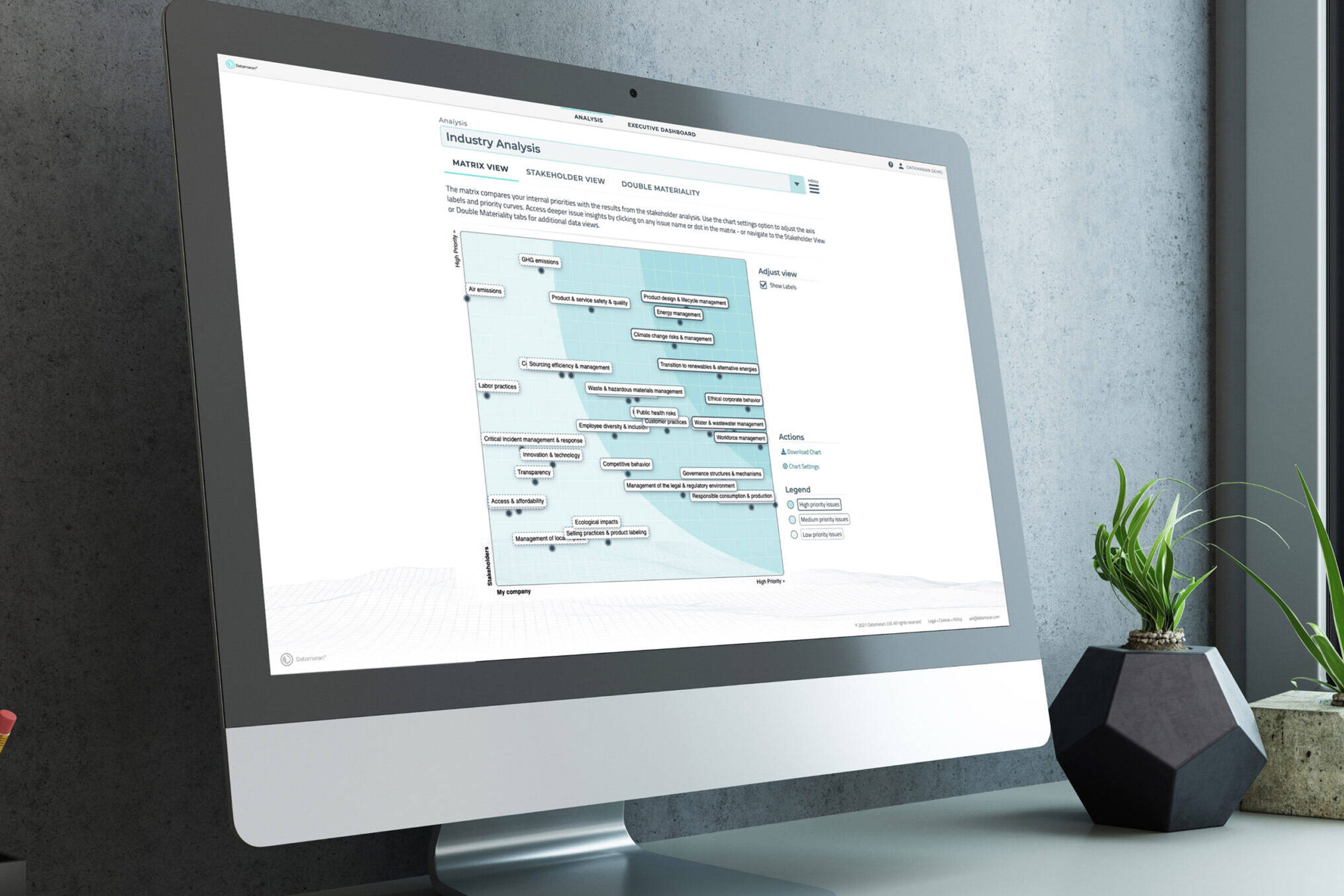
- Titillium — data-dense product interfaces: sharp and technical, but highly readable at small sizes inside complex dashboards.
- Space Grotesk + Avenir — current campaigns: distinctive and modern, with Avenir holding readability.
Each choice solved a specific problem: scannability for dashboards, impact for campaigns, neutrality for documents. The palette follows the same logic — turquoise as the signature, black for authority, white for clarity — a small, durable set that scales from a boardroom deck to a Times Square screen.
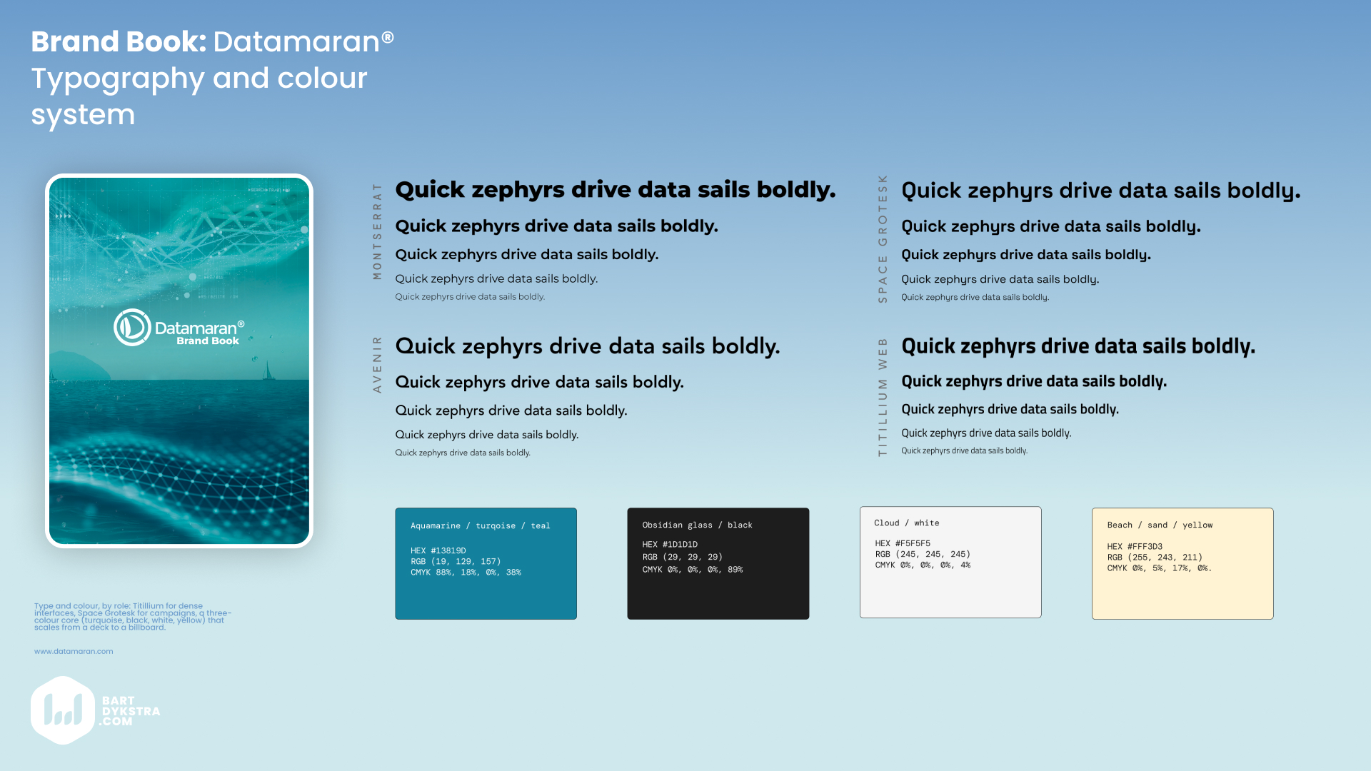
Type and colour, by role: Titillium for dense interfaces, Space Grotesk for campaigns, a three-colour core (turquoise, black, white) that scales from a deck to a billboard.
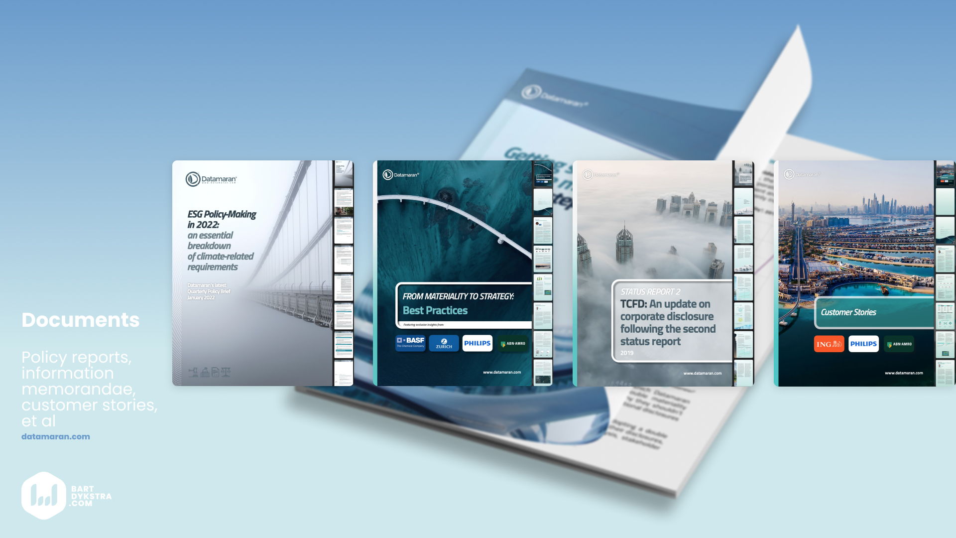
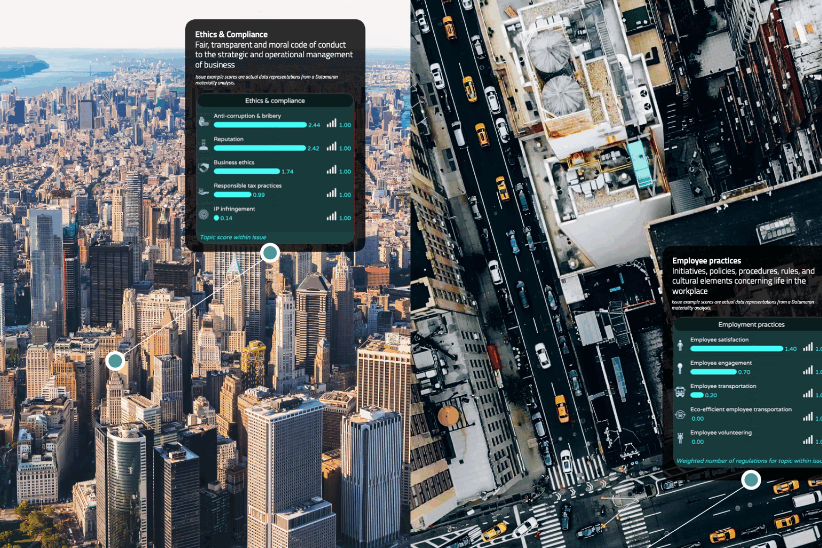
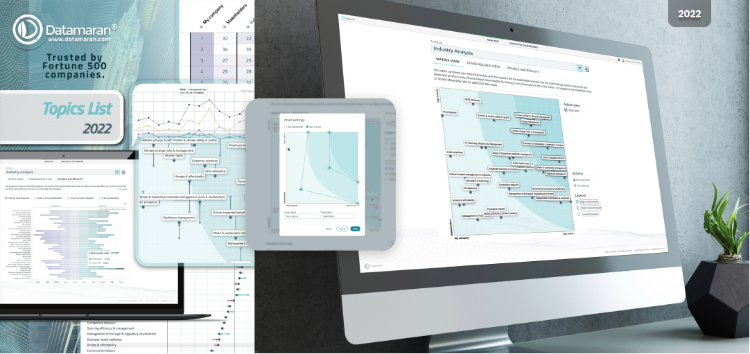
Documents and publications including data visualisations resonating the brand ID throughout.
A 360° system, including the product
The identity runs across print, social, corporate documentation, investor materials, and — critically — into the product UX itself. The same visual language a Datamaran employee sees on opening their laptop is the one their clients publish in public annual reports through Datamaran’s data visualizations. One system, consistent from internal tooling to public-facing output.
That through-line — brand and product speaking the same language — is what makes it a 360° identity rather than a logo with guidelines attached.
See the related works down below for more.