
CORPORATE REPORTING, INVESTOR RELATIONS, TRANSPARENCY, BUSINESS INTELLIGENCE
ANNUAL REPORTS, VISUALIZED
ClientDatamaranServicesDesign Lead, Data VisualizationYear2014-2026
Fortune 500 Annual Reports - Data visualization for public communication
Summary
Nike, Amazon, Philips, and Decathlon embed Datamaran's data visualizations directly into their public annual reports. I led the design of the visualization systems behind that output, turning dense corporate data into charts that executives, investors, regulators, and the public could read at a glance, and that held up under the scrutiny those documents attract.
The work lands where there is no room for error
Most data visualization lives inside a product, where a confusing chart costs a moment of friction. This work lives somewhere harder. It is published in Fortune 500 annual and impact reports, filed alongside audited financials, read by investors, analysts, and regulators, and tied to a company’s name on the record.
That raises the bar on every decision. A misleading axis is not a usability bug, it is a credibility risk for the client. The work had to be accurate to the underlying data, legible at print and screen scale, and rigorous enough to sit beside numbers that auditors had already signed off on.
Driven by a decade of disclosure pressure
Since 2014, when the EU’s Non-Financial Reporting Directive made sustainability disclosure mandatory for large companies, investor expectations moved past basic financials toward non-financial risk, impact, and materiality. The data existed. What was missing was the translation layer that turned it into something a non-specialist could understand without losing what a specialist needed to trust it.
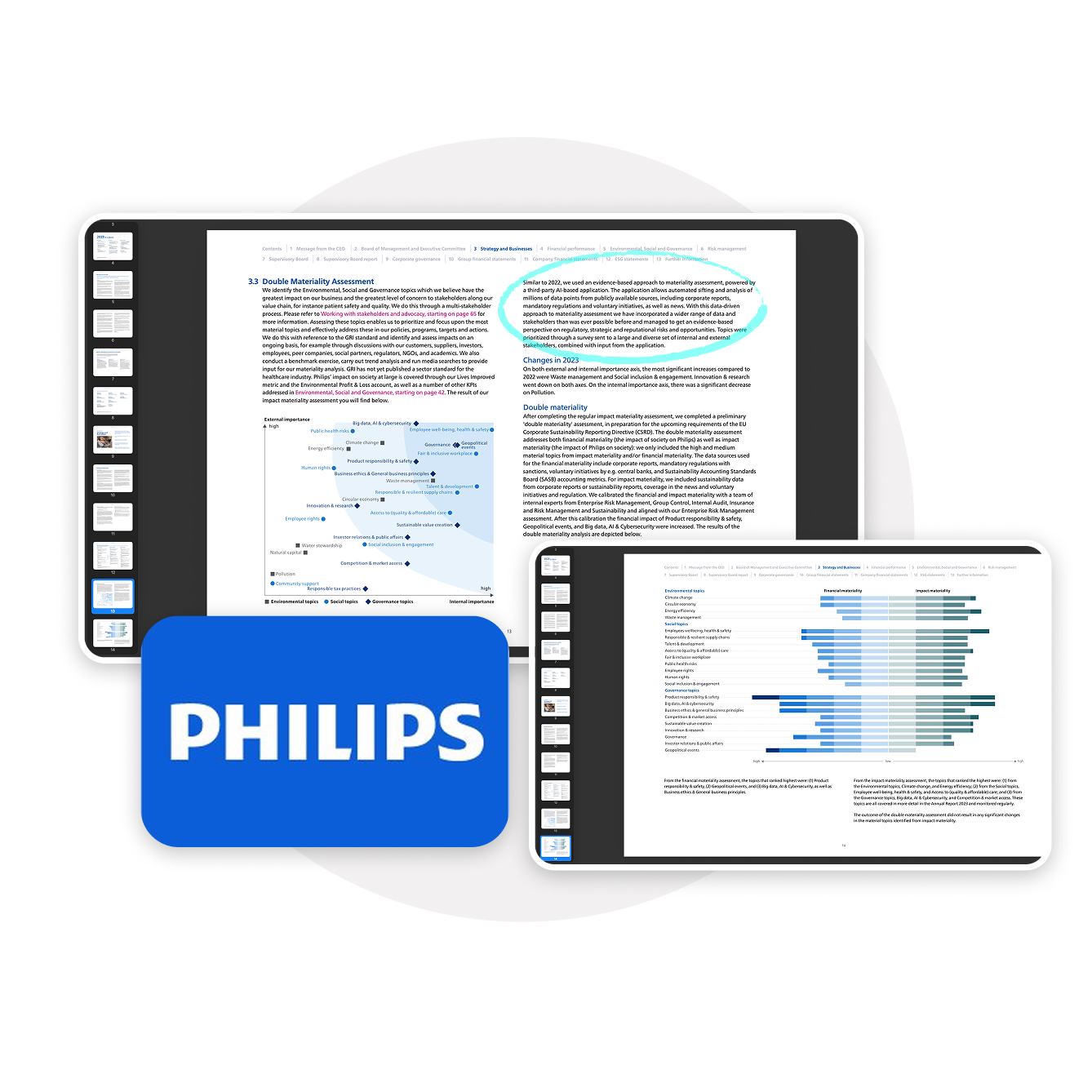
Philips’ Annual Report illustrating matrix and tornado charts.
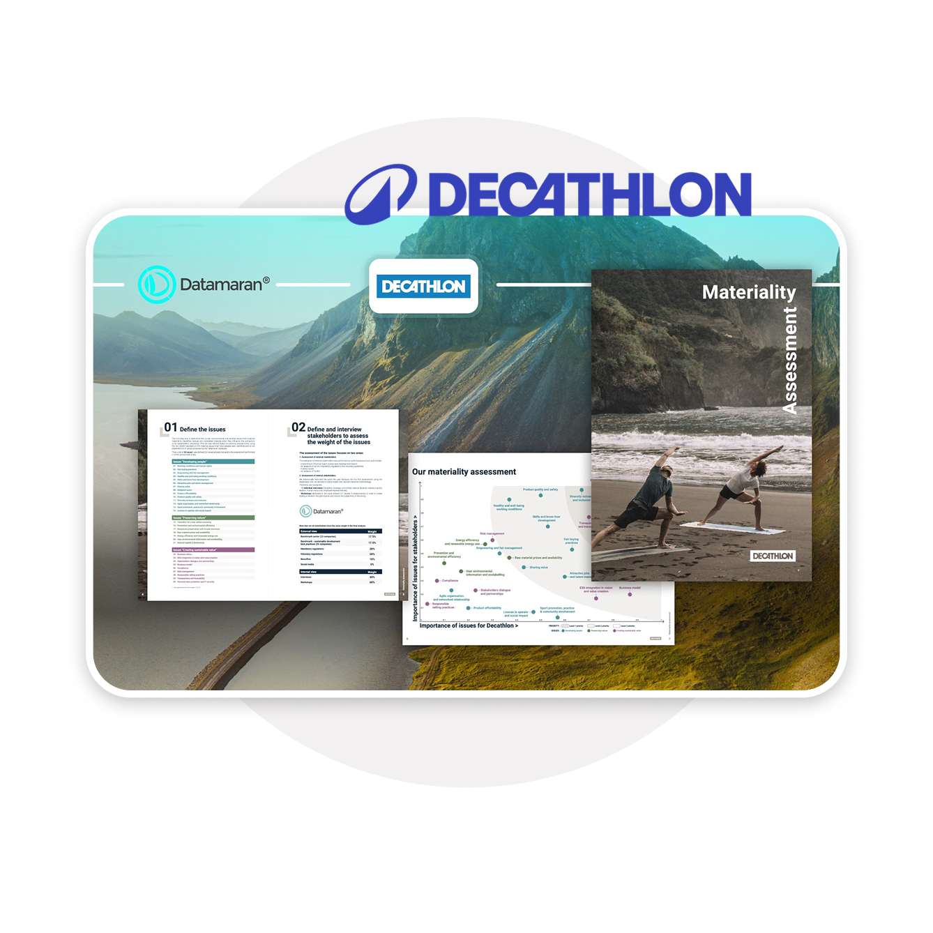
Decathlon publishing Datamaran logo and matrix visualisation in their Materiality Assessment report.
A system, not a set of charts
The answer was never a single chart. It was a visualization system: a defined set of chart types, each matched to a specific reporting job, governed by consistent rules for color, hierarchy, labeling, and accessibility so that every output read as one coherent visual language regardless of which client published it.
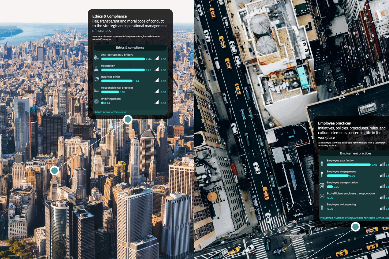
The system carries Datamaran’s brand identity straight through to the client’s printed page, the same turquoise, the same typographic logic that runs across the platform and the company’s investor-facing presence. The data behind these charts originates upstream, in the platform’s online materiality assessment, where companies rank and prioritize the issues that matter most to their stakeholders. This piece is the last mile of that journey: where the platform’s output leaves the screen and enters the public record.
The chart types, and what each one carried
Each visualization type was designed to do one job well:
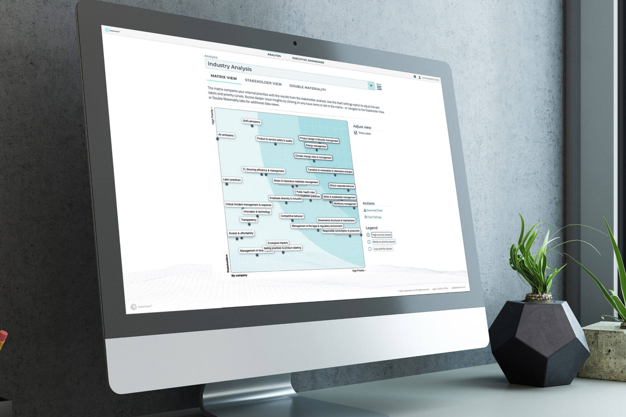
- Materiality matrix. The signature output. A two-axis plot ranking issues by stakeholder concern and business impact, legible enough for a board deck and precise enough for a disclosure appendix.
- Tornado charts. Sensitivity and risk ranking, ordered so the most material factors read first.
- Heatmaps and issue rankings. Density made navigable, so a reader could find the priority signal without reading every cell.
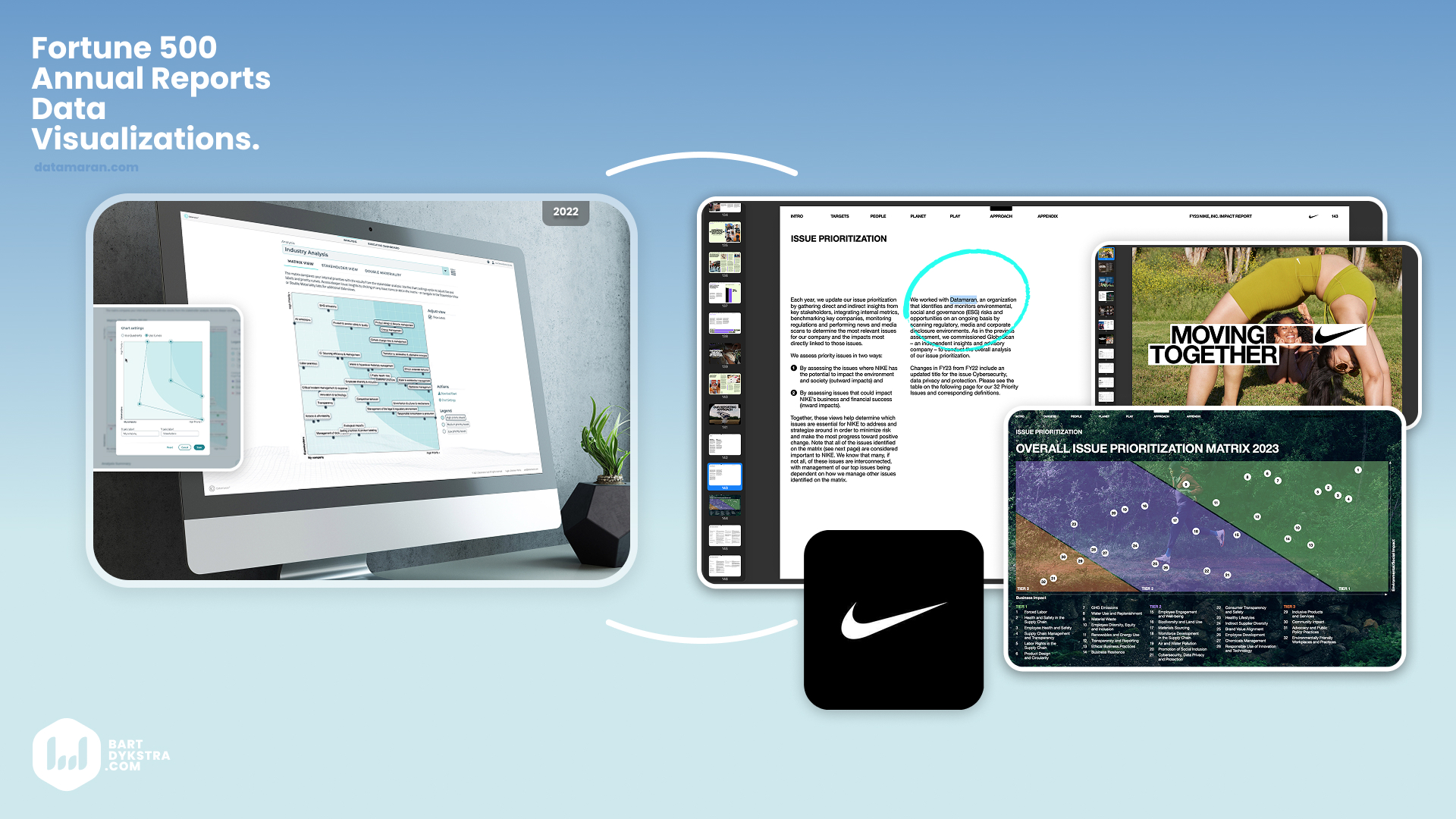
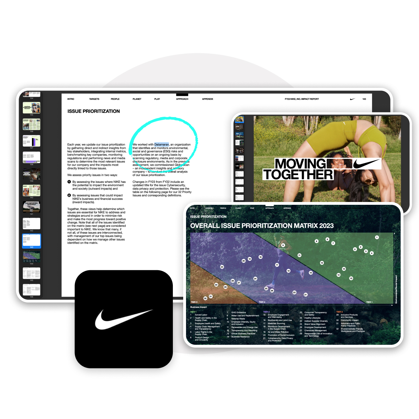
From platform to public record. The materiality matrix as it renders in the platform, beside its customized form in Nike’s FY23 Impact Report.
Published as-is, or co-designed with the client
he system was built to ship two ways. Most clients embed the standard outputs directly, trusting the defaults because the defaults were designed to be trusted. Others have specific editorial, brand, or disclosure needs, and for those I worked directly with their teams to adapt the visualizations without breaking the rules that keep them accurate and on-system. The flexibility lives in the presentation layer. The integrity of the data never moves.
What it produced
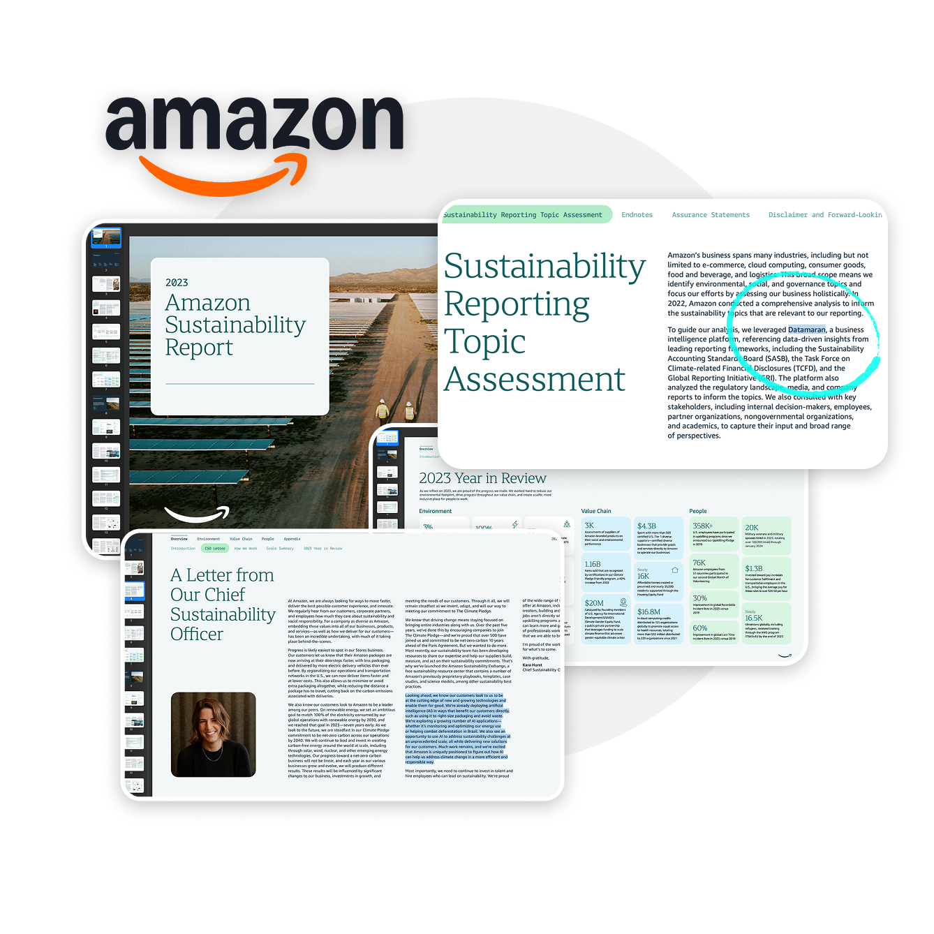
These visualizations are published in annual and impact reports from some of the largest companies in the world, several of which credit Datamaran by name. Amazon’s sustainability report and Nike’s FY23 impact report both cite the platform directly.
That is the real result. Not a screen a user navigates, but a document a company stands behind, in front of the investors and regulators who hold it to account. The work proved that data visualization, done with enough rigor, can carry a company’s credibility on the public record.
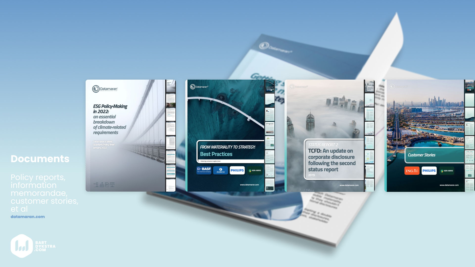
From data design to copy and layout: annual reports, policy briefs, and investor materials, crafted to inform and persuade.