
ART DIRECTION & BRAND CAMPAIGN
DM4: Materiality launch film and rollout
ClientDatamaranServicesConcept, Art Direction, Motion Design, Print & Spatial DesignYear2018, system in use through 2022
The Metaphor Makes the Decisions
Summary
In 2018, Datamaran launched its fourth platform generation with a film built on one idea: the world is already transmitting signals, and the platform is the instrument that reads them. That idea chose the key visual, killed a strong contender in one conversation, set the compositional grid, and pre-built the rollout. A successor film in 2021 and a publishing program into 2022 ran on the same idea. This is the campaign from first sketch to final frame, and past the screen into print, objects, and a room.
The brief underneath the brief
The stated brief was a launch film for DM4: Materiality. The name carries the category: materiality analysis is the discipline of deciding which non-financial issues matter enough to act on. The real brief was harder: make invisible systems visible. Datamaran reads signals across logistics, governance, labor, and climate, then turns them into corporate decisions. None of that photographs. The film had to give scale and movement to something that lives in databases, in the brand’s register. Corporate, navigational, precise. The sector’s visual language was still leaves and forests. No green cliché, no soft focus, no worthy tone.

The concept, as drawn: real-world environments as carriers, data as an overlay layer reading the scene. Everything after this idea is execution.
Concept: the world is already transmitting
The organizing idea fit in one line. Signals are everywhere in the physical world; the platform is the instrument that reads them. So the film would show the world at system scale: aerial, environmental, kinetic. The data layer would surface what the lens alone cannot.
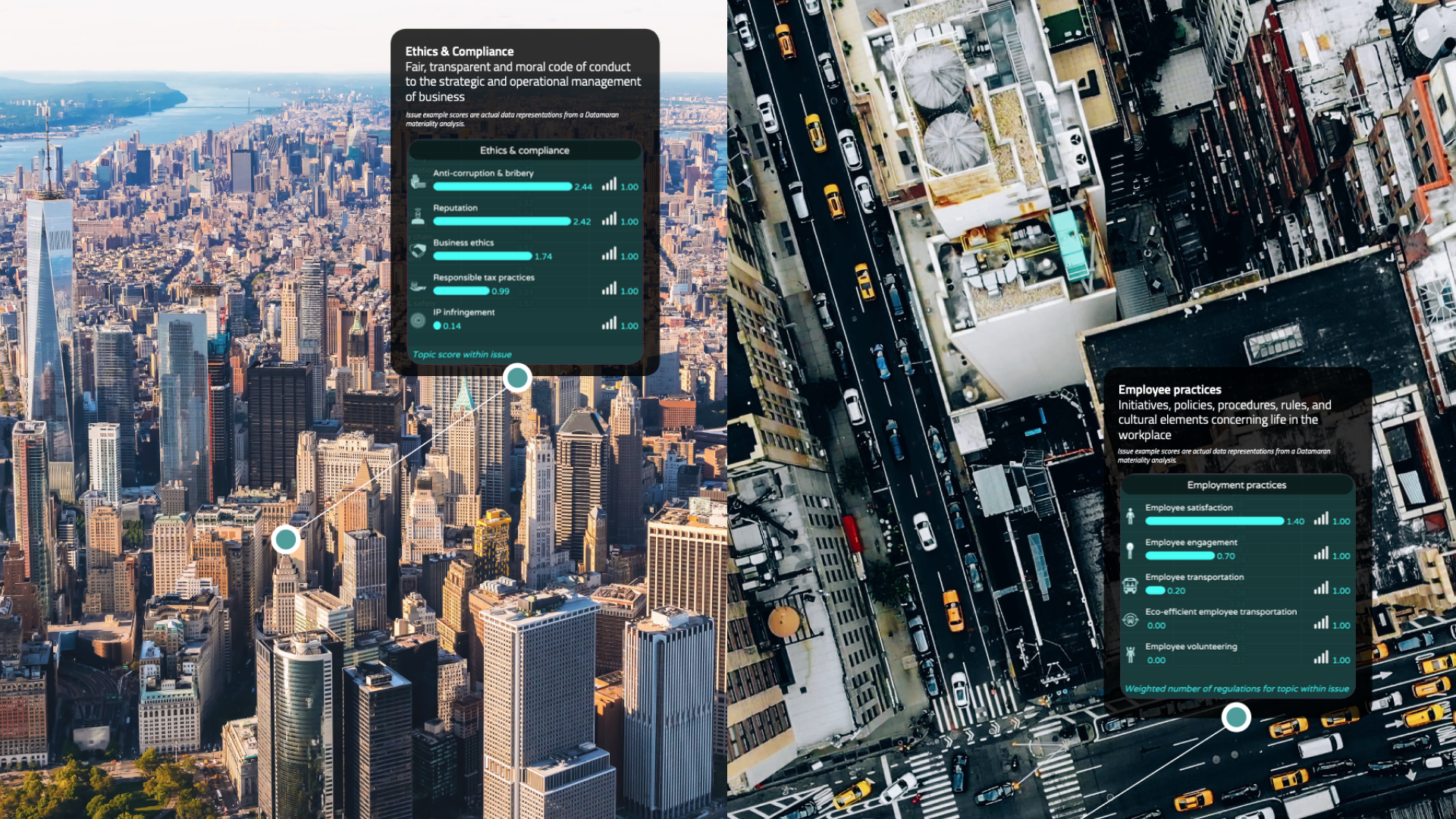
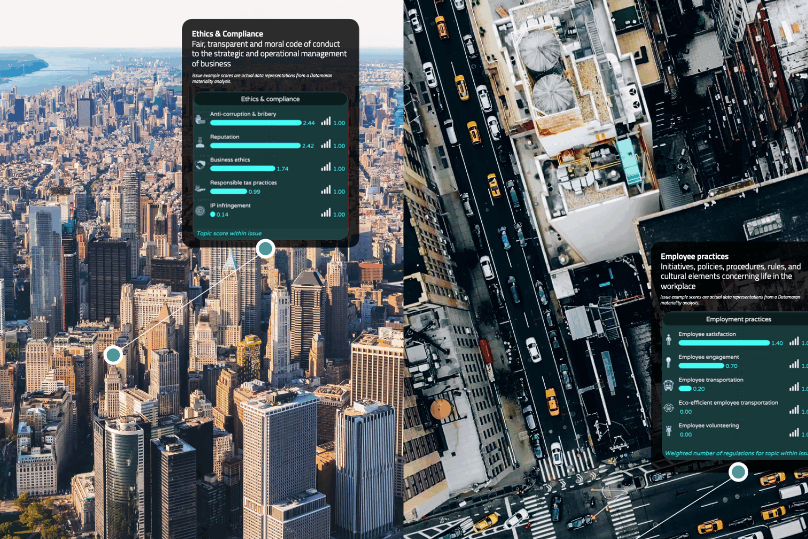
The footage itself was licensed stock. The argument was in what the motion design did to it. A data layer built to track real signals through each scene: container flows across harbor logistics, air emissions reading off rooftop units and chimneys in aerial New York. Stock as raw material, never as wallpaper. Look at any environment long enough, and the signals appear. The concept sits in the lineage of IBM’s Smarter Planet, which made invisible infrastructure the subject rather than the backdrop.


The direction not taken
An early key-visual direction put a climber on rock above water. The image tested well; the logic underneath it failed. Conquest framing: a lone figure triumphing over static terrain, the human as hero, the environment as obstacle. Everything the brand had refused since the name. The campaign needed the opposite polarity. The environment as the system, the human as the navigator within it.
The rejection took one conversation. That is what a brand metaphor is for. When the organizing idea is precise enough, it makes campaign decisions before taste enters the room.

The direction chosen
Two whales and a paddler. A human reading and riding forces of a different magnitude, at ease inside them. The same metaphor that named the company in 2014, load-bearing at campaign level four years later. And the whales carry a second argument: they are the ocean’s own transmitters, their song traveling for hundreds of kilometers through water. In a film about a world already broadcasting, the largest thing in frame is also the strongest signal in the sea. The data mesh over the water is that transmission, made visible.
Set side by side, the two frames make the whole argument of the campaign.
Rock is a wall. Water is a signal.
The compositional system
The film runs on a strict grid. Every shot was selected so a data layer could enter without fighting the image: horizons held to fixed lines, negative space reserved for annotation, movement vectors aligned with where the eye would travel to read the overlay. The data visualization was designed first, in the brand’s chart language. Then footage was chosen and cropped to receive it. Shots that could not carry the grid did not make the edit, however good they looked. The nearest precedent is MK12’s title work on Stranger Than Fiction, where footage and annotation were designed as one composition; there through shooting, here through selection.


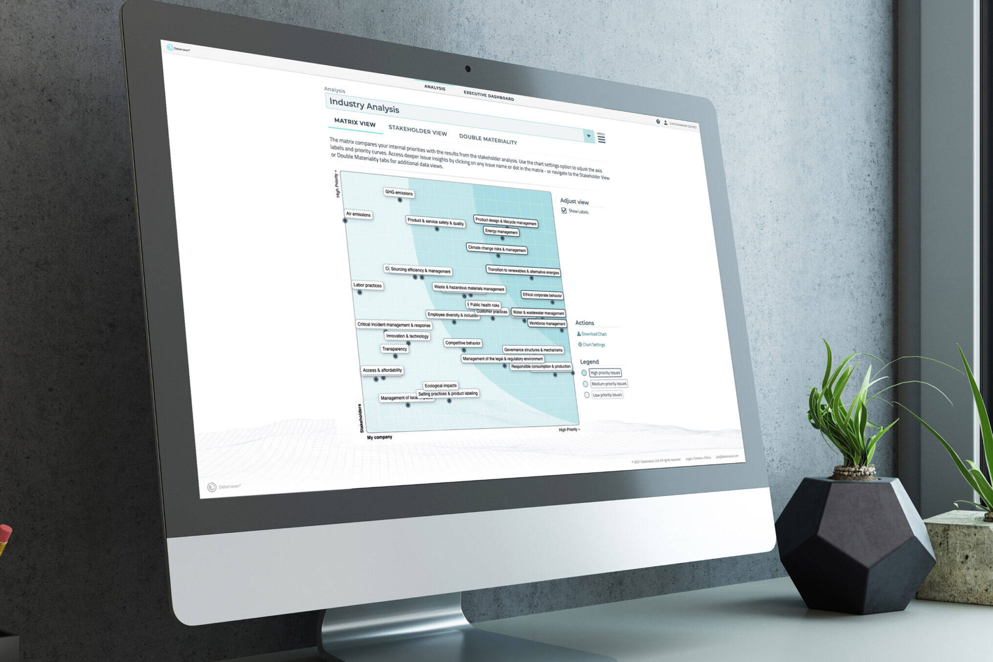
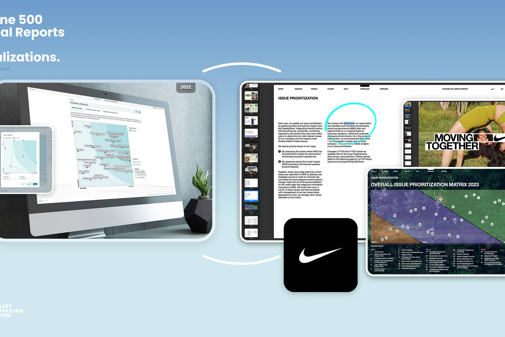
The chart language, drawn and shipped. The marker matrix beside the platform’s own materiality view, the 2018 build on screen.


Concept to frame, by sector
The discipline ran across every sector the platform reads. Each pairing sets the concept drawing beside the delivered frame: the materiality topic named on paper, then found in the world.


City overview. Traffic flow and heat-mapped towers on paper; geopolitical events, ethics and compliance, and water resources over the skyline on screen.


Harbor logistics. Responsible supply chain: the magnifier resting on one container on paper; live scores over a working night harbor on screen.


Pharmaceutical lab. Waste management on the grid, then pinned across a working lab: hazardous, non-hazardous, recycling.


Rollout: a campaign, not a film
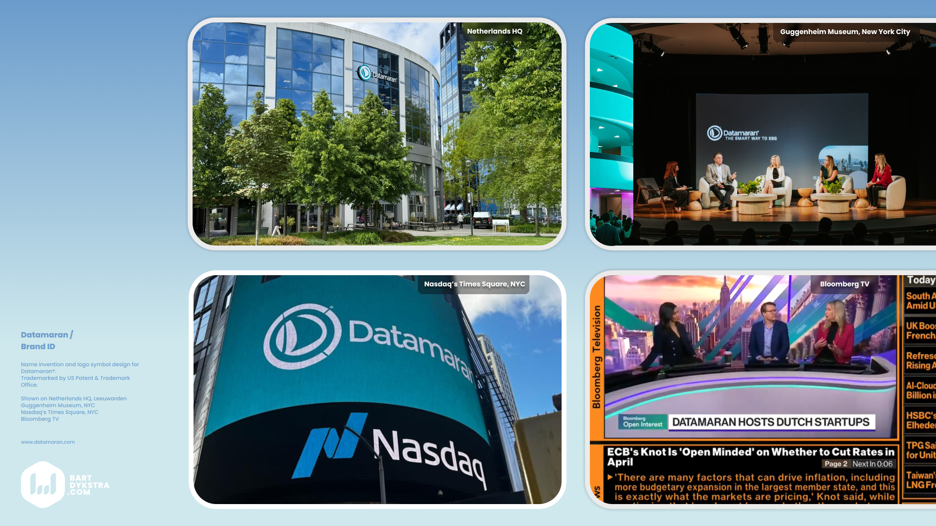
The film anchored the Materiality 4 launch, then the system fanned out. Stills and overlay graphics became social cuts, email headers, event screens, report covers, and sales materials, all running the same grid and the same chart language. Because the data layer was built in the brand system from the start, every adaptation ran on decisions already made, never on new ones.


Feeling first, data second
The film made the argument for the eye. The print and object campaign made it for the hand. Datamaran’s buyers read financial media: LSEG’s shareholder press, page after page of mining and banking advertisers competing on gravity. The strategy was contrast. Ice cream and lollipops in the middle of that spread, under one line:
The future is in your hands. Don’t. Drop. It.
Emotion opened the page; the data argument followed once attention was won. Spec-sheet ads compete for the reader’s diligence. This campaign reached the purpose-driven buyer those ads walk past. The mechanism is register contrast inside a sober medium, the same move The Economist has run in business press for decades, and Oatly runs inside commodity dairy.

The same principle scaled down to objects. The platform reads the data. The analysis decides what is material. The campaign made it material. Each object carries a product truth inside a joke, including a printed coffee ring that turns Spills, a disclosure topic the platform tracks, into water carrying a signal at cup scale.
The user forum began as a pen layout in a notebook; built, the same visual held a two-metre roll-up and a live conversation.


Credits and role
Bart Dykstra: Concept, script, art direction, motion design, data-layer design, editing, sound effects, original score, print, objects, and spatial experience.
Rogier Klomp: big data sequence animation and realtime capture. Watch more on KlompTV
Lucy van Hilten: Voice-over, script.
Nikki Wood: Marketing direction, script.
Marjella Lecourt-Alma, CEO; Jerome Basdevant, CTO; and JP Lecourt, COO/CFO: Company leadership & co-founders.
Aerial and environmental footage: licensed stock, selected and graded to the campaign system. Produced in-house at Datamaran with the entire team, across operations, marketing, product, tech, data science, and customer success.

Why it held
A campaign holds together when one idea makes the decisions. The metaphor chose the key visual, killed the wrong direction, set the grid, pre-built the rollout, and scaled from aerial film to a printed coffee ring. Four years and a platform generation on, the 2021 successor film and the publishing program into 2022 still ran on the same argument.